
Introduction
So, after months (years?) of toil in the lab, you're finally ready to share your ground-breaking discovery with the world. You've collected enough data to impress even the harshest reviewers. You've tied it all together in a story so brilliant, it's sure to be one of the most cited papers of all time.
Congratulations!
But before you can submit your magnum opus to Your Favorite Journal, you have one more hurdle to cross. You have to build the figures. And they have to be "publication-quality." Those PowerPoint slides you've been showing at lab meetings? Not going to cut it.
So, what exactly do you need to do for "publication-quality" figures? The journal probably has a long and incomprehensible set of rules. They may suggest software called Photoshop or Illustrator. You may have heard of them. You may be terrified by their price tags.
But here's the good news: It is entirely possible to build publication-quality figures that will satisfy the requirements of most (if not all) journals using only software that is free and open source. This guide describes how to do it. Not only will you save money on software licenses, you'll also be able to set up a workflow that is transparent, maintains the integrity of your data, and is guaranteed to wring every possible picogram of image quality out of the journal's publication format.
Tools
Here are the software packages that will make up the core of the figure-building workflow:
R — Charts, graphs, and statistics. A steep learning curve, but absolutely worth the effort. If you're lazy though, the graph-making program that you already use is probably fine.
ImageJ — Prepare your images. Yes, the user interface is a but rough, but this is a much more appropriate tool than Photoshop. For ImageJ bundled with a large collection of useful analysis tools, try the Fiji distribution.
Inkscape — Arrange, crop, and annotate your images; bring in graphs and charts; draw diagrams; and export the final figure in whatever format the journal wants. Illustrator is the non-free alternative. Trying to do this with Photoshop is begging for trouble.
Embed and Crop Images extension for Inkscape and The PDF Shrinker — Control image compression in your final figure files.
The focus on free software is facultative rather than ideological. All of these programs are available for Windows, Mac, and Linux, which is not always the case for commercial software. Furthermore, the fact that they are non-commercial avoids both monetary and bureaucratic hassles, so you can build your figures with the same computer you use to store and analyze your data, rather than relying on shared workstations (keep backups!). Most importantly, these tools are often better than their commercial alternatives for building figures.
Goals
First of all, this guide is not intended to be a commentary on figure design. It's an introduction to the technical issues involved in turning your experimental data into something that can be displayed on a computer monitor, smart-phone, or dead tree while preserving as much information as possible. You will still be able to produce ugly and uninformative figures, even if they are technically perfect.
So, before we dive into the details of the figure-building workflow, let's take a moment to consider what we want to accomplish. Generally speaking, we have four goals: accurately present the data, conform to the journal's formatting requirements, preserve image quality, and maintain transparency.
Data don't lie
And neither should your figures, even unintentionally. So it's important that you understand every step that stands between your raw data and the final figure. One way to think of this is that your data undergoes a series of transformations to get from what you measure to what ends up in the journal. For example, you might start with a set of mouse weight measurements. These numbers get 'transformed' into the figure as the vertical position of points on a chart, arranged in such a way that 500g is twice as far from the chart baseline as 250g. Or, a raw immunofluorescence image (a grid of photon counts) gets transformed by the application of a lookup table into a grayscale image. Either way, exactly what each transformation entails should be clear and reproducible. Nothing in the workflow should be a magic "black box."
Follow the formatting rules
Following one set of formatting rules shouldn't be too hard, at least when the journal is clear about what it expects, which isn't always the case. But the trick is developing a workflow that is sufficiently flexible to handle a wide variety of formatting rules — 300dpi or 600dpi, Tiff or PostScript, margins or no margins. The general approach should be to push decisions affecting the final figure format as far back in the workflow as possible so that switching does not require rebuilding the entire figure from scratch.
Quality
Unfortunately, making sure your figures look just the way you like is one of the most difficult goals of the figure-building process. Why? Because what you give the journal is not the same thing that will end up on the website or in the PDF. Or in print, but who reads print journals these days? The final figure files you hand over to the editor will be further processed — generally through some of those magic "black boxes." Though you can't control journal-induced figure quality loss, you can make sure the files you give them are as high-quality as possible going in.
Transparency
If Reviewer #3 — or some guy in a bad mood who reads your paper five years after it gets published — doesn't like what he sees, you are going to have to prove that you prepared the figure appropriately. That means the figure-building workflow must be transparent. Every intermediate step from the raw data to the final figure should be saved, and it must be clear how each step is linked. Another reason to avoid black boxes.
This workflow should accomplish each of these goals. That being said, it's not really a matter of follow-the-checklist and get perfect figures. Rather, it's about understanding exactly what you're doing to get your data from its raw form to the (electronic) journal page.
A computer's view of the journal page
In order to understand how to get data into a presentable form, we need to consider a few details of how visual information gets represented on a computer.
Raster data vs. vector data
There are two fundamentally different ways that visual information can be described digitally. The first is by dividing an image into a grid, and representing the color of each cell in the grid — called a pixel — with a numeric value. This is raster data, and you're probably already familiar with it. Nearly all digital pictures, from artsy landscapes captured with high-end cameras to snapshots taken by cell phones, are represented as raster data. Raster data is also called bitmap data.
The second way computers can represent images is with a set of instructions. Kind of like "draw a thin dashed red line from point A to point B, then draw a blue circle with radius r centered at point C," but with more computer-readable syntax. This is called vector data, and it's usually used for images that can be decomposed into simple lines, curves, and shapes. For example, the text you're reading right now is represented as a set of curves.
Resolution
Storing visual information as raster or vector data has an important impact on how that image gets displayed at different sizes. Raster data is resolution dependent. Because there are a finite number of pixels in the image, displaying the image at a particular size results in an image with a particular resolution, usually described as dots per inch (dpi) or pixels per inch (ppi). If a raster image is displayed at too large a size for the number of pixels it contains, the resolution will be too low, and the individual pixels will be easily visible, giving the image a blocky or "pixelated" appearance.
In contrast, vector data is resolution independent. Vector images can be enlarged to any size without appearing pixelated. This is because the drawing instructions that make up the vector image do not depend on the final image size. Given the vector image instruction to draw a curve between two points, the computer will calculate as many intermediate points as are necessary for the curve to appear smooth. In a raster image a curve must be divided into pixels when the image is created, and it isn't easy to add more pixels if the image is enlarged later.
Often, raster images have a specified resolution stored separately from the pixel values (a.k.a. metadata). This resolution metadata isn't really an integral part of the raster image, though it can be useful for conveying important information, such as the scale factor of a microscope or the physical size at which an image is intended to be printed. Similarly, vector images may use a physical coordinate system, such as inches or centimeters. However, the coordinates can be scaled by multiplication with a constant, so, as with raster images, the image data is independent of the physical units.
Efficiency
So, if vector data is resolution independent, why use raster data at all? It's often a question of efficiency. Vector data is great for visual data that can be broken down into simple shapes and patterns. For something like a graph or a simple line drawing, a vector-based representation is probably going to be higher quality and smaller (in terms of file size) than a raster image. However, as images get more complex, the vector representation becomes progressively less efficient. Think of it this way: As you add more shapes to an image, the number of drawing instructions needed for the vector representation also increases, while the number of pixels in the corresponding raster image can stay the same. At some point, resolution independence is no longer worth the cost in file size and processing time.
There's a second very important reason why raster data may be preferable to vector data. Many images are so complex that the simplest shapes into which they can be divided are, effectively, pixels. Consider a photograph. One could create a vector image based on outlines or simple shapes in the picture, but this would be a cartoon approximation — shading and textural details would be lost. The only way to create a vector image capturing all the data in the photograph is to create many small shapes to represent the smallest details present — pixels.
Another way to think about this is that some visual data is natively raster. In raster images from digital cameras, each pixel corresponds to the signal captured by a single photosite on the detector. (This is literally true for the camera attached to your microscope, but the full story is a bit more complicated for consumer cameras.) The camera output is pixels, not lines and curves, so it makes sense to represent the image with raster, rather than vector data.
Rasterization and resampling
At some point, almost all vector data gets converted into raster data through a process called rasterization. Usually this happens just before the image is sent to a display or printer, because these devices are built to display and print pixels. That's why your monitor has a screen resolution, which specifies the pixel dimensions of the display area. Because vector-format images are resolution independent, they can be rasterized onto pixel grids of any size, but once rasterized, the image is then tied to that particular pixel grid. In other words, the rasterized image contains less information than the original vector image — rasterization causes a loss of image quality.
A similar loss of image information can occur when raster images are redrawn onto a new pixel grid. This process, called resampling, almost always results in an image that is lower quality, even if the pixel dimensions of the resampled image are increased. Why? Consider an image that is originally 100px × 100px, but is resampled to 150px × 150px. The problem is that many of the pixels in the new image do not directly correspond to pixels in the old image — they lie somewhere between the locations of the old pixels. We could assign them values based on the average of the neighboring pixels, but this will tend to blur sharp edges. Alternatively, we could just duplicate some of the old pixels, but this will shift boundaries and change shapes. There are fancier algorithms too, but the point is, there is no way to exactly represent the original raster data on the new pixel grid.
The takeaway from all this is that rasterization and resampling are to be avoided whenever possible. And when, as is often the case, rasterization and resampling are required to produce an image with a particular size and resolution, rasterization and resampling should only be done once — and as the very last steps in the workflow. Once vector information has been rasterized and raster images have been resampled, any further manipulation risks unnecessary quality loss.


Color spaces
Whether an image is represented by raster or vector data, there are a variety of ways to store color information. Every unit of the image — pixels in raster images and shapes/lines/curves in vector images — has an associated color value. There isn't any practical way to represent the more or less infinite light wavelengths (and combinations thereof) perceived as different colors in the real world, so in the digital world, we take shortcuts. These shortcuts mean that only a finite, though generally large, number of colors are available. Different shortcuts make available slightly different sets of colors, called color spaces.
More precisely, color spaces are sets of colors, while the types of numerical color descriptions discussed below are color models. Color models are mapped onto color spaces, ideally based on widely agreed upon standards so that a particular color model value actually appears the same in all situations. Of course things are generally more complicated than that. Rarely do different computer monitors, for example, display colors exactly the same way.
Grayscale
The simplest color representation has no color at all, just black, white, and shades of gray. A grayscale color is just a single number. Usually, lower numbers are closer to black and higher numbers are closer to white. The range of possible numbers (shades) is determined by the bit depth, discussed later. Another name for this color model is single-channel, which comes from raster images, where each pixel stores one number per image channel.
RGB
Adding actual color means adding more numbers (a.k.a., more channels). The most common system uses three channels, and is named after the colors each of them represents: red, green, and blue. RGB is an additive color model — the desired color is created by adding together different amounts of red, green, and blue light. Red and green make yellow; red and blue make purple; green and blue make aqua; and all three together make white. Computers use RGB color almost exclusively. It's also the color model journals want to see in your final figures, the better for displaying them on readers' digital devices. This workflow builds figures using RGB color.
CMYK
Another way to add color to an image is to subtract it. In subtractive color models, each channel represents a pigment absorbing a certain color. CMYK color represents a common color printing process, with cyan, magenta, yellow, and black inks (the K stands for "key"). Once upon a time, journals would ask for CMYK figures to facilitate printing, but now, when there is a print edition, the journal's production department usually handles the conversion from RGB to CMYK. If, for some reason, Your Favorite Journal insists on CMYK figures, you'll need to take a look at the appendix, which discusses some possible solutions (none very good, unfortunately). Note that since CMYK color has four channels, a CMYK raster image will be 1/3 larger than the equivalent RGB raster image. The CMYK color space also contains 1/3 more possible unique colors than the RGB color space, although in practice, RGB models usually represent a broader range of perceived colors than CMYK models.
HSL, HSV, and HSB
Several related models specify colors not by adding or subtracting primary colors, but with parameters related to color perception. These generally include hue (sort of like wavelength), saturation (the precise definition varies, but some measure of color intensity), and lightness, value, or brightness (different kinds of dark/light scales). You're most likely to encounter one of these models in a color-picker dialog box, since the maps of these spaces tend to be more intuitive than RGB or CMYK. However, the colors are usually mapped directly to an RGB model.
YUV, YCbCr, and YPbPr
Similar to the HSL family of color models, these models include separate brightness and hue components. The Y channel is called the luminance value, and it is basically the grayscale version of the color. The other two channels are chrominance values, different systems for specifying hue. These color models are associated with old-fashioned analog video (think pre-2009 television) and various video compression formats where some color information is discarded to reduce the video size (loss of chrominance information is less noticeable than loss of luminance information).
Indexed, mapped, and named colors
If an image contains relatively few colors, it's sometimes possible to save space by indexing them in a color table. Each color in the table can then be identified with a single index value or label, such as "SaddleBrown", which your browser probably maps to RGB (139,69,19). Spot colors are named colors used to refer to specific inks for printing rather than for subsetting the RGB color space.
Bit depth
The range of numbers available in a particular channel is determined by the channel's bit depth, named for the number of bits (0s and 1s) used to store each value. Images with higher bit depth can describe finer shades and colors, though at the cost of increased file size. Pixels of a 1-bit single-channel raster image can hold one of two values, 0 or 1, so the image is only black and white. Pixels of an 8-bit image hold values from 0 to 255, so the image can include black, white, and 254 shades of gray in between. Pixels of a 16-bit image hold values from 0 to 65,535. However, the 8-bit image will be eight-times the file size of the 1-bit image, and the 16-bit image will be twice the file size of the 8-bit image, assuming they all have the same pixel dimensions.
Nearly all computer monitors are built to display 3-channel 8-bit images using the RGB color model. That's (28)3 ~ 16.77 million possible colors and shades, if you're counting. 8-bit RGB is so deeply ingrained in computer graphics, that you're relatively unlikely to encounter anything else in ordinary computer use, with the exception of 8-bit grayscale or an 8-bit single-channel color table mapped to 8-bit RGB values. 8-bit RGB is sometimes called 24-bit RGB, because 8-bits per channel × 3 channels = 24-bits total per pixel.
When a larger than 8-bit image does get produced — even the sensors in most cheap digital cameras capture images that are 10-bits per channel — it is often automatically down-sampled to 8-bit. This is fine for ordinary photos, but potentially problematic for microscopy images. That fancy camera attached to your microscope probably captures 12- to 16-bit images. One of the major challenges of building figures with these images is creating the necessary 8-bit representations of them without inadvertently hiding important information. Information will inevitably be lost, but it's important that the transformation to 8-bit is fully under your control.
You'll often see 8-bit RGB values in base-16 or hexadecimal notation for compactness. This is usually a string of 6 digits/letters, often preceded by "#" or "0x", with each character pair representing one channel. The letters "a" through "f" are used to represent "digits" 10 through 15. For example "6c" equals (16×6)+12 = 108 in base-10. "#ff9933" is RGB (255,153,51).
Preparing figure components
Now that we've covered the basics of how computers represent visual information, let's move on to the nuts and bolts of building a figure. We'll consider a three-step workflow: preparing individual figure components from your data, combining multiple components together in a figure, and exporting the final figure file in Your Favorite Journal's preferred format.
Graphs and charts
Graphs and charts are obvious candidates for vector data. They're easily decomposed into shapes (bar-chart, dot-plot), and if you have to resize them, you want all those lines and curves to stay sharp and un-pixelated. Even if you will need to submit your final figures as raster images, it makes sense to keep charts as vector drawings as long as possible to avoid quality loss from resampling.
Lots of software packages can be used to draw charts and export them as vector data, but my personal favorite is R. R is a scripting language focused on statistical computations and graphics. It's free, open-source, and has a large variety of add-on packages, including the Bioconductor packages for bioinformatics. Plus, because R is a scripting language, it's easy to customize charts, keep a complete record of how you made them, and automate otherwise repetitive tasks. I even used several R scripts to help build this website, although that's not one of its more common uses.
The downside of R's power and flexibility is a substantial helping of complexity. If you're on a deadline, you might want to skip down to the part about saving vector-format charts from other programs. Know too that the steepness of the learning curve is inversely proportional to your programming experience. That said, the ultimate payoff is well worth the initial effort. There are lots of books and websites about R — UCLA has a very nice introduction — so here we'll restrict our focus to how to take a chart you've created in R and export it in a format that can be placed into your final figures.
Exporting vector graphics from R
This section assumes a basic familiarity with R. If you want to put off learning R until later, skip down to the next section.
In R, objects called devices mediate the translation of graphical commands. Different devices are used to create on-screen displays, vector image files, and raster image files. In an R console, type ?Devices to see a list of what's available. If you don't explicitly start a device, R will start one automatically when it receives a graphics command. The default device is operating system-dependent, but it is usually an on-screen display.
The easiest device to use for exporting charts in vector format is pdf, which, as you might guess, makes PDF files. Other vector-format devices are also possible, including postscript, cairo_ps, svg, cairo_pdf, and win.metafile. They all have their strengths and weaknesses, but I've found that pdf reliably produces PDFs that are both consistently viewable on many computers and easily imported into Inkscape for layout of the final figure.
All you need to do to get PDF files of your figures is to wrap your plotting code in commands to open and close a pdf device:
# Start the graphics device
pdf(file = "MyAwsomeFigure.pdf", useDingbats = FALSE)

# Do some plotting
par( mai = c(1,2,1,2), lwd = 96/72, pch = 16, ps = 8 )
plot( value ~ group, data = my.data.frame,...
...

# Close the graphics device
dev.off()
And that's it. There are just a few bits to keep in mind:
Setting
useDingbats = FALSEon thepdfdevice makes larger files, but it also prevents issues when importing some charts into Inkscape.By default,
pdfmeasures fonts in points (1/72 in.), but everything else in 1/96 in.The default color space is RGB. It's possible to create a CMYK-formatted PDF, but the conversion process is not well documented.
The default page size is 7 in. × 7 in. If you need to change this, set
width = X, height = Ywhen you open the device.If you want to try out a different device, just replace
pdfwith your device of choice. Keep in mind that some devices produce raster images instead of vector images.Don't forget to call
dev.off()to close the device, or you won't be able to open your PDF.
Exporting vector-format charts from any other program
Not all chart-making programs give you an explicit option to export charts as vector-format files such as PDF, PostScript, or EPS. If one of those options is available, use it (of the three, PDF is usually the best choice for importing into Inkscape for layout of the final figures). If not, printing the chart and setting a PDF maker as the printer will often do the trick. Don't worry if there's more on the page than just your chart, since it will be possible to pull out the chart by itself when you import it into Inkscape. To check if the resulting PDF really does contain vector data (PDFs can also contain raster images), open the file and zoom in as much as you can. If you don't see any pixels, you're all set. This method works for charts created in Excel or PowerPoint — just save the whole spreadsheet or presentation as a PDF.
High-bit-depth images
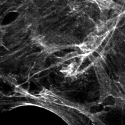
Most measurement tools that produce raster data — from cameras used for immunofluorescence microscopy to X-ray detectors — don't produce images that are directly displayable on a computer screen. They produce high-bit-depth images, and including these images in figures often presents a challenge. On the one hand, the images are natively composed of raster data, so the actual pixel values have important meaning which we want to preserve. However, because they are not directly displayable, they must be downsampled before they can be included in a figure. Our goal is to transform high-resolution, high-bit-depth images to 8-bit RGB in a way that is reproducible and does not hide important information from the original data.
The process of preparing a raster image for display in a figure should be kept completely separate from image analysis and quantification, which should always be based on the original, unaltered image data. Figure preparation should also be kept separate from and downstream of processing steps intended to apply to actual measurements, such as deconvolution algorithms. It is important to save original image data along with a record of every transformation applied to derive the image displayed in a figure.
The most useful program for preparing high-bit-depth images for publication is ImageJ. It can open a very large variety of original high-bit-depth image formats which is both convenient and important for maintaining the integrity of your data. It also has useful analysis tools (many contained in the Fiji distribution), is open-source and easy to extend, and gives you complete control of the transformation to an 8-bit RGB image. While many popular photo editing programs, including Photoshop, can be used to open high-bit-depth images and convert them to 8-bit RGB, none offer the transparency and degree of control provided by ImageJ. That flexibility is important, both for preparing the highest quality presentation of your data and for ensuring that important information from your data is not inadvertently hidden.
Lookup tables
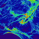
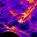
The key to creating a figure-ready image from high-bit-depth raster data is a lookup table, or LUT for short. The LUT is a function mapping each potential value in the high-bit-depth image to a corresponding 8-bit RGB value. Suppose, for example, you have a 12-bit image, which can contain pixel values from 0 to 4,095. One LUT might map 0 to RGB (0,0,0), 4,095 to RGB (255,255,255), and every value in between 0 and 4,095 to the linearly interpolated RGB value between black and white. This LUT would produce a simple grayscale image. However, it's not the only possible LUT. Another LUT might map values from the 0-1,000 range specifically to the red channel – RGB (0,0,0) to RGB (255,0,0) – and values from the 1,001-4,095 range to grayscale values. The advantage of a LUT such as this is that it increases the ability to discriminate between original data values in the final figure. After all, there is no way to map 4,095 shades of gray onto 255 shades of gray without loosing some detail.
It's worth noting that whenever a high-bit-depth image is displayed on a computer monitor, there is an implicit LUT which automatically generates an 8-bit RGB image. This is because both monitors and the software controlling them are built to display 8-bit RGB values — they don't know what to do with raster data using other bit depths or color models. ImageJ is such a useful program because it deals with the LUT explicitly.
To try out different LUTs in ImageJ, open up an image – stick with a single-channel image for now – and click on the LUT button in the toolbar (alternatively, choose Image > Lookup Tables from the menu). This will show a rather large list ranging from grayscale to primary colors to plenty of more fanciful options. Just stay away from the Apply LUT button, which has the totally unhelpful function of downsampling the image to single-channel 8-bit, rather than what we want to eventually get to, 8-bit RGB. For now, just pick a LUT you like.
If for some reason you're not happy with the available choices, it is possible to create a custom LUT (Image > Color > Edit LUT...). Note that LUTs in ImageJ are limited to 256 possible values, with everything else determined by interpolation.
Setting the LUT range
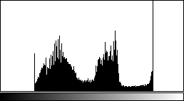
Once you've decided on a LUT, the next step is to determine the range of values on which you want it applied. It will often be the case that the interesting information in your high-bit-depth raster data is concentrated in the middle of range — in other words, very few pixels have values that are very close to zero or very close to the maximum value. Remember that it usually isn't possible to assign a unique color for every value, so when this is the case, it makes sense to focus your attention on the range containing most of the pixels.
To set the LUT range in ImageJ, you can use either of two tools: Image > Adjust > Brightness/Contrast... (Shift-C) or Image > Adjust > Window/Level.... The Brightness/Contrast tool lets you set the minimum and maximum pixel values which will be mapped to the extremes of the LUT. Pixels between the minimum and maximum values are assigned RGB values based on the LUT. Any pixels below the minimum or above the maximum don't disappear, but they are forced to the LUT extremes, and won't be distinguishable from each other.
The Brightness/Contrast tool also lets you set properties called "brightness" and "contrast," which are just parameters used to set the minimum and maximum pixel values indirectly. Adjusting the brightness shifts the minimum and maximum together, while adjusting contrast brings the minimum and maximum closer together or farther apart. The Window/Level tool does exactly the same thing — window is the equivalent of contrast, and level is the equivalent of brightness.
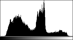
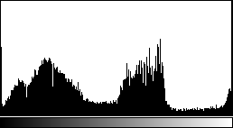
Both tools conveniently display a histogram of your image, which is a good quick check to make sure you're not hiding too much of your data below the minimum or above the maximum (to see a larger histogram, click on your image and press H). Also with both tools, if you want to set values by typing them in rather than with sliders, click on the Set button. Avoid the Apply button, which will downsample your image and prevent further changes.
Comparison to photo editing programs
If you're familiar with photo editing programs, all of this might sound a bit familiar. These programs also let you adjust brightness and contrast, and they do accomplish more or less the same thing. The main difference is that in most photo editing programs, these commands actually transform the underlying image data. In ImageJ, they just alter the mapping function for the LUT, and no actual changes are made to the raster data until you create an 8-bit RGB image. That means that in photo editing programs, adjusting the brightness and contrast causes the loss of image information — i.e. a reduction in image quality. This loss of information will occur during the creation of the RGB image in ImageJ too, but in photo editing programs, each adjustment results in the loss of more information. Unless you are extremely disciplined and make only one adjustment, the quality of the final image will suffer. Since changing the LUT in ImageJ does not affect the original raster data, it's much easier to preserve image quality, even if you want to test out lots of different LUT settings.
Some photo editing programs also allow you to make other adjustments affecting images, such as gamma corrections or curves to transform color values. These adjustments basically just define implicit LUTs — if the input value is plotted on one axis and the output value is plotted on the other, the LUT can be visualized as a line or curve defining how the different input values are mapped to outputs. Gamma is just a way to specify a simple curve, but in principle, all sorts of funny shapes are possible. Many journals explicitly prohibit these types of image adjustments because they can sometimes hide important details from the data. The grayscale and single-color LUTs in ImageJ won't violate these prohibitions — they look like straight lines — but that doesn't mean they can't hide data if you're not careful. Remember that it simply isn't possible to show all the data in a high-bit-depth image, so set the LUT with care.
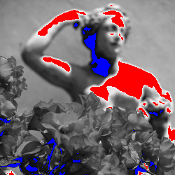
Multi-channel images
It's quite likely that many of your high-bit-depth images have more than one channel. One particularly common source of multi-channel raster data comes from immunofluorescence microscopy, where signals from multiple fluors are captured and recorded on separate channels. In the final figure, each channel can be presented as a separate RGB image, or multiple channels can be combined together in a single RGB image. Either way, each channel will need its own LUT. Note that if you want to present separate panels of each channel along with a combined "overlay" panel, it's easiest to prepare 8-bit RGB images for each individual channel and a totally separate RGB image for the combined panel, rather than trying to create the combined panel from the individual channel RGB images.
To separate a multi-channel image into several single-channel images in ImageJ, use the Image > Color > Split Channels command. Each resulting single-channel image can then be assigned a LUT and range as described above. To set LUTs and ranges on a multi-channel image, just use the c slider along the bottom of the image to select which channel you want to deal with. Changes from the LUT menu or the Brightness/Contrast tool will apply to that channel. A helpful tool accessible from Images > Color > Channels Tool... or pressing Shift-Z can be used to temporarily hide certain channels — choose Color from the drop-down menu to view only the currently selected channel or Grayscale to view it using a generic grayscale LUT. If you want to combine several single-channel images into a multi-channel image, use the Image > Color > Merge Channels... command.
When setting LUTs for a multi-channel image, keep in mind that the resulting RGB value for any given pixel will be the sum of the RGB values assigned to that pixel by the LUTs for each channel. So, for example, in a two-channel image, if a pixel gets RGB (100,50,0) from one LUT and RGB (50,75,10) from the other LUT, the final value will be RGB (150,125,10). Remember that the maximum value in 8-bit RGB is 255. If adding values from multiple LUTs exceeds that, the result will still be stuck at 255.
A good way to avoid the possibility of exceeding the maximum 8-bit value of 255 in two- or three- channel images is to make sure that each LUT is orthogonal, or restricted to separate RGB color components. For a three-channel image, this means one LUT assigning shades of red, the second assigning shades of green, and the third assigning shades of blue. For two-channel images there are many possibilities. A good choice is to use shades of green (RGB (0,255,0)) and shades of magenta (RGB (255,0,255)), since green tends to be perceived as brighter than blue or red individually. It's also helpful for the not-insignificant number of people who are red-green colorblind.
Strictly speaking, LUTs are orthogonal if (1) they can be defined as vectors in the color model coordinate space; and (2) the dot products of each pair of LUTs equal zero. Under this definition, orthogonal LUTs don't necessarily guarantee that final RGB component values larger than 255 can be avoided. Consider three LUTs mapping minimum values to RGB (0,0,0) and maximum values to RGB (0,255,255), RGB (255,0,255), and RGB (255,255,0). These vectors are at right-angles in RGB space, but it's easy to see that sums on any of the RGB coordinates could exceed 255. However, if the LUTs are orthogonal and the sum of their maxima does not exceed 255 on any axis, then any set of LUT coordinates specifies a unique point in RGB space. If these conditions are not met, some RGB colors may result from multiple different combinations of LUT axis coordinates, introducing ambiguity. As you may have guessed, it is not possible to have more than three orthogonal LUTs in an RGB color model.
Generating the 8-bit RGB image
Once you have assigned LUTs and set their ranges to your satisfaction, generating an 8-bit RGB image is easy. Just choose Image > Type > RGB Color from the menu. This will generate a brand new 8-bit RGB image representation of your original high-bit-depth raster data. If you have a single-channel image and used a grayscale LUT, you can save file space by making a single-channel 8-bit image instead of an RGB image: Image > Type > 8-bit. Be careful with this option though, since it changes the current file rather than creating a new one. Just use Save As instead of Save, and you'll be fine. For both RGB and grayscale images, be sure to avoid quality-degrading image compression when you save the file. Avoid Jpeg at all costs. Both Tiff and PNG are safe choices. Note that there's no need to worry about cropping the image at this stage. It's easier to do that later, when preparing the figure layout.
Be careful not to overwrite your original high-bit-depth image file with the 8-bit RGB image. It's best to think of this as creating a totally new representation of your original data, not applying an adjustment on top of the original image.
If you used a LUT other than grayscale or shades of a simple color, your readers might find it helpful to see a LUT scale bar in the final figure. To make a scale image that can be included in the figure layout, choose File > New > Image... from the menu. Set Type: to 8-bit, Fill With: to Ramp, Width to 256, and height to 1. Clicking Ok will give you a long, thin gradient image. Don't worry that it's only one pixel thick — you'll be able to stretch it later. Select the LUT for which you want to create a scale, set the image type to RGB Color, save the image, and you've got your LUT scale bar.
Ordinary images
Some pictures are just pictures — for example, pictures taken with ordinary digital cameras. There's no direct quantitative relationship between the pixel values and your measurements, and the images are 8-bit RGB format to begin with. These images can be included in figures as they are, without the process of setting LUTs. And generally, that's exactly the best thing to do. However, if you decide that the image does need some sort of processing, such as conversion to grayscale to save money on page charges or color correction to compensate for poorly set white-balance, try to do all the adjustment you need in one transformation, since each individual transformation can reduce image quality. Also, keep a copy of the original image file, both because it's the original data, and so if (when) you later decide you don't like the transformed image, you can apply a different transformation to the original image and avoid more quality loss than is absolutely necessary. As with high-bit-depth images, there's no need to worry about cropping ordinary images just yet.
Figure layout
Now that we have the individual components for a figure, it's time to put them all together. The workflow discussed here uses Inkscape, a very flexible (and free) vector graphics editor. The most commonly used non-free alternative to Inkscape is Adobe Illustrator. While it is sometimes possible to create figures using Photoshop, it's generally a bad idea. Why? Because Photoshop is designed to deal primarily with raster data. While it does have limited support for some types of vector data, everything is still tied to a single pixel grid. This means that, unless you are extremely careful, every image component imported into the figure will be resampled, probably multiple times, and most vector components will be rasterized, potentially resulting in significant quality loss. Every manipulation, including scaling, rotating, and even just moving figure components in Photoshop requires resampling. While the changes can be subtle, quality loss from resampling operations is additive — the more operations, the worse the final image will look.
Inkscape, on the other hand, is geared toward vector data and has no document-defined pixel grid. Raster images can be imported into Inkscape as objects that can be positioned, stretched, rotated, and cropped repeatedly, all without resampling. This makes Inkscape a great tool for combining both vector and raster components together in one document — exactly what we need to create a figure layout. There are plenty of general tutorials available on the Inkscape website, so we'll restrict our focus to important tasks related to the figure-building workflow.
Before starting on the figure layout, it's helpful to set a few basic document properties (File > Document Properties...). Note that all of these settings can be changed later without affecting your figure:
The
Pagetab sets page size and default units. Page size is mostly a convenience feature — the page boundaries won't actually show up in the final figure file — but it can be matched to your journal's figure size limits.Default unitssets the units shown on the page rulers as well as the default units choice in most option panels. Inches and centimeters are probably self-explanatory.ptmeans PostScript points (1/72 in.), andpcmeans picas (12 points).pxisn't really pixels — this isn't a raster document — it means 1/90 in.The
Gridtab can be used to create a grid for aligning objects on the page. Toggle display of the grid by pressing#. Snapping to the grid or other objects can be controlled by the buttons on the snapping toolbar, usually displayed at the right of the window.
The file format used by Inkscape is called SVG, which is short for scalable vector graphics, a perfectly accurate, if generic, description of what the file format contains. SVG is a text-based markup language for representing vector graphics. That means you can open up an SVG file in a text editor and see the individual instructions describing how to draw the image, or even write an SVG file entirely by hand. It also means that developing software to manipulate SVG files is pretty easy. Additionally, SVG is a Web standard, so most modern browsers can be used to view SVG files — many of the figures on this page are SVG. When displayed in the browser, one SVG pixel (1/90 in.) does equal one HTML pixel.
Importing vector files
Inkscape is able to import many vector-format file types, but the most reliable is PDF. For some file types, such as PostScript (.ps), EPS, WMF, EMF, and Adobe Illustrator (.ai), Inkscape can correctly recognize most, but not all, features of the file. Inkscape can open SVG files, of course, but SVG files created by other programs sometimes cause problems. PDF import usually goes smoothly, which is all the more useful since many programs can save PDF files. Multi-page PDFs can also be imported, though only one page at a time.
The easiest way to import a vector-format file is just to open it (File > Open...). Some imported files can be difficult to work with because their objects are bound together in redundant groups. To undo these, do Edit > Select All followed by a few repetitions of Object > Ungroup. Then just copy the imported vector objects, or a subset of them, and paste them into your figure. Note that the imported objects become part of the figure SVG file. Changing the imported file later won't affect the figure, so if you regenerate a chart PDF, you'll have to delete the old version in the figure SVG and import the chart PDF again.
The upside to having the imported vector data included as objects in the SVG file is that they're completely editable. That means it's possible to change things like fill colors and line widths, which can go a long way to creating a unified look for your figures, even if you're including charts created in several different programs. Editing imported text, however, may not be possible, especially if the imported file used a font which is not available on your computer.
Importing images
To import an image file into your figure, choose File > Import... from the menu, or just drag in the file from a file manager. This should be either an 8-bit grayscale image or an 8-bit RGB image. Inkscape will let you choose whether to embed the image or to link it. Selecting embed will write the actual image data into the SVG file. On the other hand, selecting link will store only a reference to the location of the image file on your computer. Linking the image is a better option for two reasons. First, it will keep your SVG file nice and small, even if it contains many large images. Second, if the linked image is changed — if, for example, you go back and generate a new 8-bit RGB file using different LUTs — the changes are automatically reflected in the SVG. The downside is that if the location of the image file is changed, the link will need to be updated (which can be done by right-clicking on the image and selecting Image Properties).
When first imported, the image is likely to be quite large, since Inkscape will size the image to be 90dpi by default. The image can be scaled to a more appropriate size, of course, though take care not to inadvertently scale the width and height separately. Some journals have rules stipulating a minimum resolution for images. To calculate the resolution of an image within the figure, just divide the width or height of the image in pixels (the real pixels in the raster image, not Inkscape "pixels" – opening the image in ImageJ is a good way to get the dimensions) by the width or height of the image in Inkscape. Alternatively, if you've scaled the image by a certain percentage after importing it, divide 9,000 by that percentage to get the resulting resolution.
Clipping masks
To crop an image (or any object) in Inkscape, add a clipping mask, which is any other path or shape used to define the displayable boundaries of the image. The clipping mask just hides the parts of the image outside its boundaries — it won't actually remove any data. So if you decide you want to go back and change how you've cropped an image, it's easy to do so.
To create a clipping mask, first draw a shape to define the clipping mask's boundaries. A rectangle is usually most convenient, but any closed path will do. Position the shape on top of the image that should be cropped. Don't worry about the color and line style of the shape — it will be made invisible. Then select both the image and the clip path (hold Shift and click on both), right-click on the path, and choose Set Clip from the menu. The parts of the image outside the path should disappear. To remove a clipping mask from and image, just right-click on it and choose Release Clip from the menu.
Calculating scale bars
Use the widget below to calculate scale bar lengths for a microscopy image. Use the width or height of the entire image before the addition of a clipping path. The scale factor will depend on your microscope, objective, camera, as well as any post-acquisition processing, such as deconvolution. Once you have determined the appropriate size for the scale bar, draw a horizontal line starting at the left edge of the page — enable snapping to the page boundaries, use the Beizer curve tool (Shift-F6), and hold Ctrl to keep the line straight. Then switch to the Edit paths by nodes tool (F2) and select the node away from the page boundary. Move this node to the correct position by entering the appropriate bar size in the X position field in the toolbar at the top of the screen. Be sure that the units drop-down box is set correctly. Now the line will be exactly the right length for a scale bar, and it can be styled (thickness, color, etc.) and positioned however you like.
This method for creating scale bars probably seems convoluted, but it's better than using a scale bar drawn onto the raster image by the microscope capture software. The precision of scale bars drawn onto the raster image is limited by the inability to draw the end of a line in the middle of a pixel. The precision of scale bars drawn in Inkscape is limited only by the precision of the calculations.
Exporting final figure files
Is the layout of your Nobel-prize-worthy figure complete? Then it's time to export a file that can be shared with the world. We'll discuss two ways to export a final figure, at least one of which should satisfy Your Favorite Journal's production department — creating high-resolution Tiff images and creating EPS or PDF files.
Image compression
Inkscape's handling of image compression is a bit opaque. This section outlines what you need to do to make sure image compression occurs on your terms. Some of the steps here are non-reversible, so it's a good idea to save your figure as a separate SVG file before you proceed.
By default, Inkscape applies Jpeg compression to linked Tiff images as they are imported. The linked image file itself isn't affected, but the version of the image that Inkscape stores in the computer's memory and uses to render the document is. This means that everything Inkscape does with the image — including on-screen display and export in any format, even if the export format does not use image compression — will contain compression artifacts. You may have noticed that some of your imported images do not look quite the same as they did in ImageJ. The way to avoid compression artifacts is to embed the images as the last step before exporting the final figure file.
To embed all the linked images in their entirety, choose Extensions > Images > Embed Images... from the menu. Note that this command alters the SVG file, so if you save it, be careful not to overwrite your SVG file with linked images! One potential drawback to this approach is that even parts of images that are hidden by clipping masks are embedded in the file. This won't matter at all for creating a final Tiff image, but if you want to export the final figure as an EPS or PDF file, including all of the image data, rather than just the visible image data, can seriously inflate the file size. To help deal with this issue, I've created an Inkscape extension that will crop images before embedding them in the SVG document. You can find instructions for downloading and installing the extension here. Once the extension is installed, you can run it by clicking Extensions > Images > Embed and crop images. Note that as of now, only rectangle-based clipping masks are supported. The extension includes the option to apply jpeg compression, but we want to avoid compression at this stage, so select PNG for the image encoding type. As with the Embed Images... command, this extension is destructive, so take care not to overwrite your original file.
![[Inkscape handling of linked Tiff images]](img/fht-inkscape-jpg.svg)
Creating Tiff images
Creating a Tiff image requires rasterization of all the vector data in the figure, but as long as this is the last step of the workflow, quality loss can be kept to a minimum. Unfortunately, Inkscape will not export Tiff images directly, so we'll have to export a PNG image then convert it to Tiff using ImageJ. PNG images don't include compression that will result in image quality loss, so the only trouble this causes is the need for a few more clicks.
To export a PNG image of your figure, select File > Export Bitmap... or press Shift-Ctrl-E. Select either Page or Drawing as the export area, depending on whether or not you want to include any whitespace around the page boundaries (the former will, the latter will not). Use the pixels at box to set the image resolution to at least 600 dpi, or the minimum resolution specified by the journal. Then enter a filename and select Export. To convert the PNG file to a Tiff, just open it in ImageJ and do File > Save As > Tiff....
Creating EPS or PDF files
Creating EPS or PDF files is even easier. Just do File > Save As... and select either Encapsulated PostScript (*.eps) or Portable Document Format (*.pdf) from the Save as type: list. And that's it!
Unless, that is, the journal does not want full-resolution figure files for the initial submission, but wants a limited size PDF instead. The PDFs exported directly from Inkscape are almost certain to be too large, because the images they contain are uncompressed — exactly what you want to send to the printer, but not too convenient for emailing to reviewers. Note that even if you linked or embedded Jpeg images in the SVG file, the resulting PDF will still contain uncompressed images. The solution is to create a full-resolution PDF, then apply compression to the images within it. The PDF Shrinker makes this easy.
The bottom line
Skipped to the bottom because you didn't want to read the whole thing, or looking for a recap? Here's the four-point summary:
Prepare your charts and graphs in vector format;
Use ImageJ to apply lookup tables to your high-bit-depth images to create 8-bit RGB images you can include in the figure;
Layout the vector and raster components of your figure using Inkscape; and
Export the a final file in the format requested by Your Favorite Journal.
Approaching figure-building using this workflow pushes all the format-specific steps to the very end, so if you change your mind about where you want to submit the paper, you shouldn't have to rebuild the figures from scratch — just re-export files in the new format. Also, this workflow avoids rasterization and resampling whenever possible. In fact, if the final figures are PDF or EPS files, rasterization and resampling can be avoided completely. Even though the journal's production department will likely resample and compress your figures anyway, submitting the highest quality images possible can minimize the damage.
Publication-quality figures? Check. Transparent path from your raw data to the final figure? Check. All done with zero impact on your budget? Check. Go spend the money on another experiment instead.
Appendix
CMYK figures
There are some journals that still insist you give them figures using a CMYK color model. This doesn't make much sense — far more people will see your paper on a screen (native RGB) than on the printed page. Still, rules are rules. If you encounter such a situation, there are four options:
Switch from Inkscape to Adobe Illustrator, which has much better support for CMYK color;
Complete the standard RGB workflow, export a Tiff with RGB color, then convert it to a CMYK Tiff as the last step;
Complete the standard RGB workflow, export a PDF or EPS file with RGB color, then convert it to CMYK; and
Ignore the rule and submit your figures as RGB.
Before deciding which approach to take, it's worth considering what sort of graphical elements are in your figures, and how converting to CMYK is likely to affect them. Also consider whether or not preserving vector-format information in your final figures is important, since converting the color space of a Tiff image (option 2) is likely to be considerably easier than converting the color space of a PDF or EPS file (option 3).
Preparing raster figure components for CMYK
For raster components that already have an 8-bit RGB color model — for example, images from digital cameras and scanners — it's best to leave them as is rather than trying to convert them before completing the figure layout. The rational for this is similar to the rational for avoiding resampling operations. Color space transformations potentially involve loss of information. If they are required, they should only be done once, and as late in the workflow as possible.
For raster data that does not have a natively associated color model, but to which a color model is applied when preparing an image component for the figure — for example, immunofluorescence images — the situation is a bit more complicated. CMYK colors are not additive like RGB, so creating multi-channel overlay images is not so simple. It can be accomplished by importing each channel as a separate layer in Photoshop and coloring each layer separately, but there is no widely accepted way to do it. Further confusing matters, the pixel values in CMYK are backward compared to RGB — 0 is lots of pigment and 255 is no pigment. The safest option is to prepare the figure components as 8-bit RGB, then handle the conversion later. Unfortunately, once the images are converted to CMYK, there will no longer be a straightforward linear relationship between the CMYK pixel values and the original raster data.
Color conversion
Color space conversions are determined by color profiles (ICC profiles), which specify the relationship between an image file or device color space and a standard color space. If an image file and a device both have an associated color profile, color values in the image can be matched to appropriate color values on the device based on transformations through the two profiles. Color profiles can also be used to specify transformations between different document color models (RGB to CMYK or vice versa). Standard color profiles often associated with RGB images are "sRGB" and "Adobe RGB (1998)". A standard color profile often associated with CMYK images is "U.S. Web Coated (SWOP) v2." Note that unless your monitor is both calibrated and associated with its own color profile, CMYK colors you see (as implicitly converted back to RGB) might not be the most faithful representation of the CMYK colors that will be printed.
To create a CMYK figure layout in Illustrator, set the document color space to CMYK and, for PDF export, set a destination CMYK color profile. It should also be possible to use Illustrator to convert RGB format EPS or PDF files to CMYK, though it may be necessary to convert each element in the figure separately, rather than simply changing the document format. Refer to the Illustrator documentation for more details. RGB Tiff files (and most other raster image formats) can be converted to CMYK in Adobe Photoshop (do Image > Mode > CMYK Color). A free software alternative is GIMP with the Separate+ plugin.
Note that the extremes of RGB color space — especially bright greens and blues — don't translate well into CMYK. If you are planning on using CMYK output and have high-bit-depth images, it may be best to avoid LUTs based on shades of green or blue. Alternatively, applying gamma transformations on the cyan and yellow channels after color conversion may improve the appearance of greens and blues in the final CMYK figures. Keep in mind though, each color conversion or transformation you add will degrade the final image quality.
Author Information
Benjamin Nanes, MD, PhDUT Southwestern Medical Center
Dallas, Texas
Web: https://b.nanes.org
Github: bnanes